
The Lovit App is focused on providing condoms and other realated items for a very low cost with a discret delivery package.
Role: UI Designer Year: 2019
Role: UI Designer Year: 2019
The Lovitapp team contact me to help them to develop their MVP (minimum Viable Product). But they don’t have nothing about the design process for that reason I had to start from scratch with the foundations and them they decided to work on the user purchase flow, to make it real I had to design the entire assets like icons and illustrations.
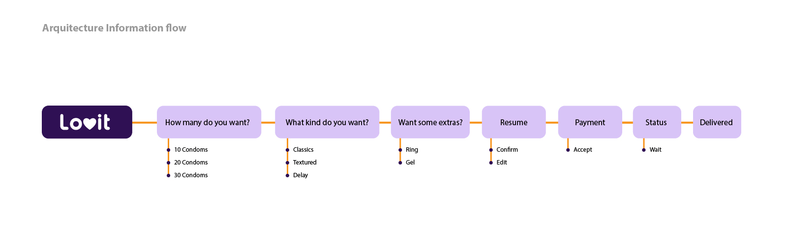
To start this project, I had to understand the data that the client provide me, so the first step was to represent the app flow with the information provided by the client.
When I understand the client idea in my head, I started with the most simple step, wich is benchmarking. Throught this method you can analyze how other people are boarding similar problems. Then your mind starts mixing your first ideas with the other ones to conceive a great answer to the problem.
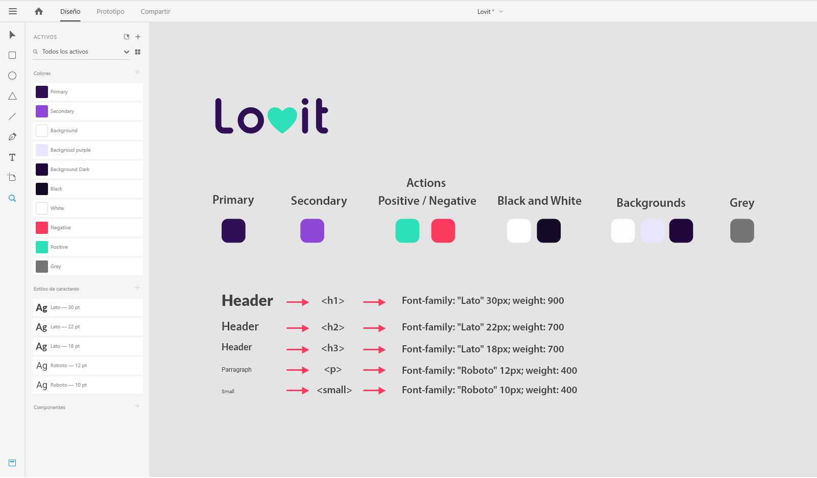
Before starting to design, I always organize the app's foundations like: colors, typography, hirerchy and app's personality.
This is one of the funniest steps in the process. It's here where you can create many ways to solve the main problem, with the chance to fail. You know, fail fast and fail cheap :).
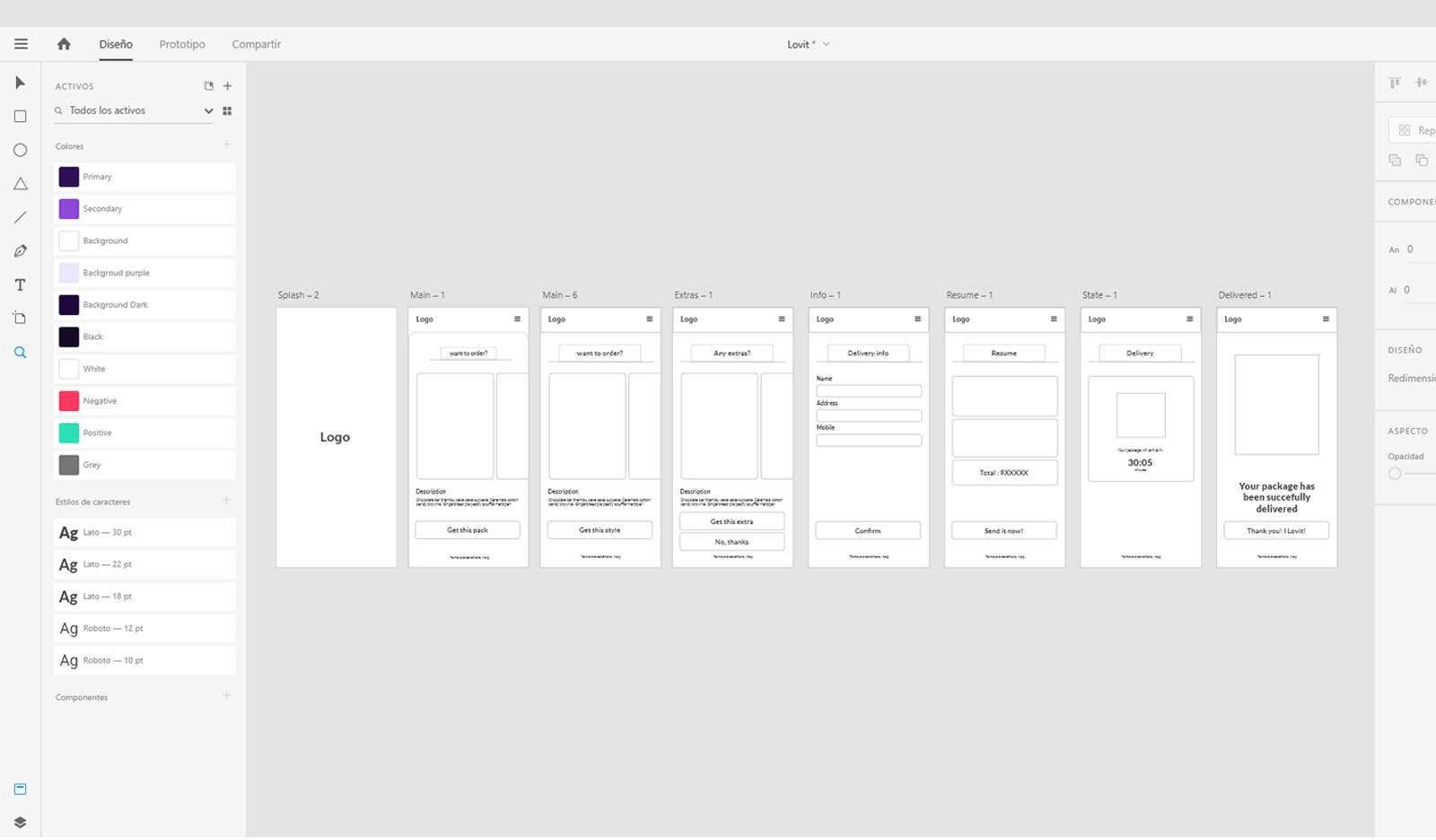
Now with all the products defined with the data that the client gave me, I started with the approved wireframes. It's always a good practice if you set your foundations ordered in a library.
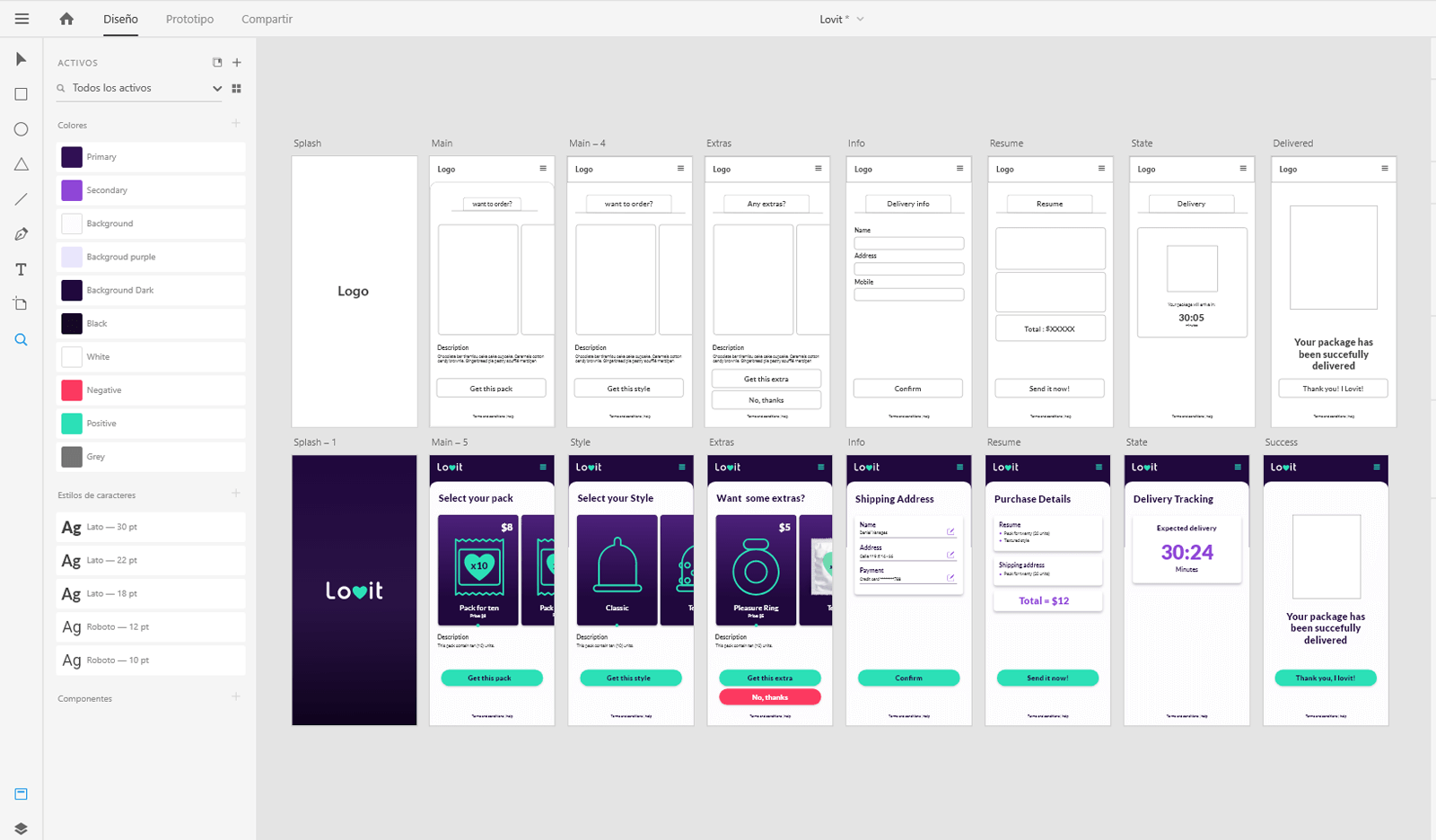
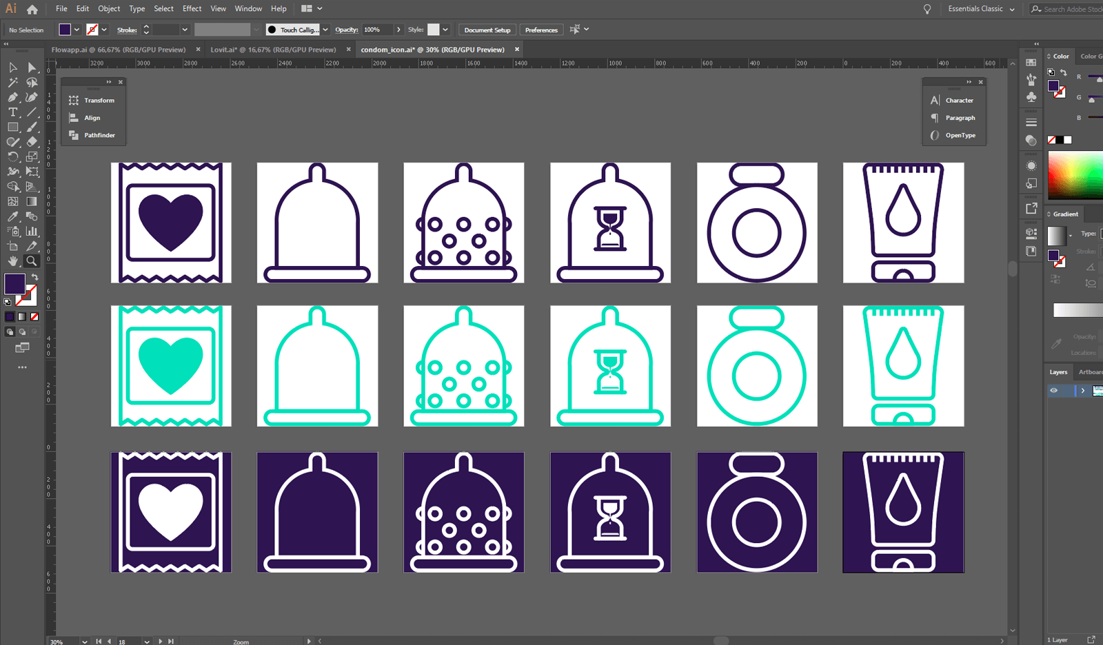
I used Adobe Illustrator to create the icons. It's very important to use a grid system to ensure consistency in sizing. Also, keep in mind to use the same stroke weight for all the icons. In This case I made very simple icons that represent the products in a direct way.
I used After effects to emulate the user behavior within the app. This was the result, hope you like it :)